Imagine a world where even the most remote communities are seamlessly connected, where opportunity flows as freely as high-speed data. That’s the vision Speed Connect Austria set out to achieve by bringing fiber-optic internet to rural Austria—a mission to bridge the digital divide and uplift communities that traditional providers have often overlooked. For them, it’s more than just internet speeds; it’s about empowering people and businesses to thrive, regardless of their location.
When Speed Connect Austria approached DOIT, they weren’t looking for just a brand—they were looking for a story. This identity could speak directly to rural Austria, making connectivity feel both tangible and transformative. Our first step was immersion: understanding what connectivity would truly mean for these communities. What we found wasn’t just a need for faster internet; it was a need for belonging, for participation in a future where technology doesn’t bypass them but meets them at their doorstep. Armed with these insights, we set out to shape a brand that felt close, familiar, and forward-looking.
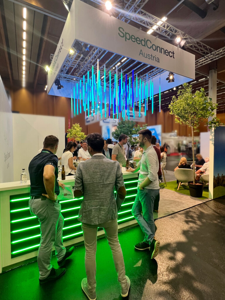
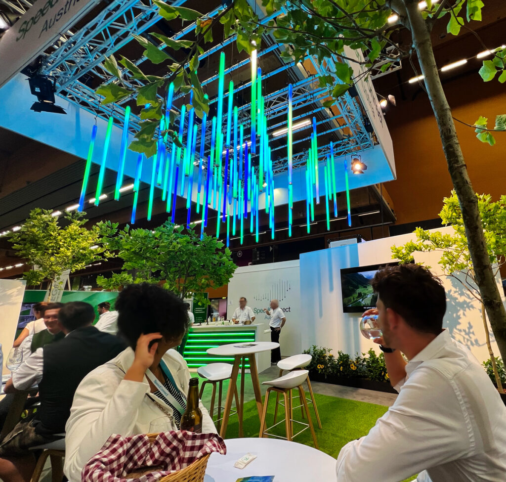
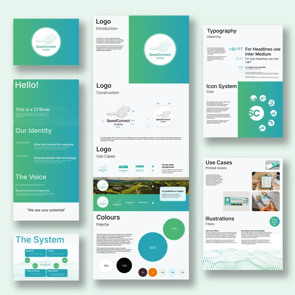
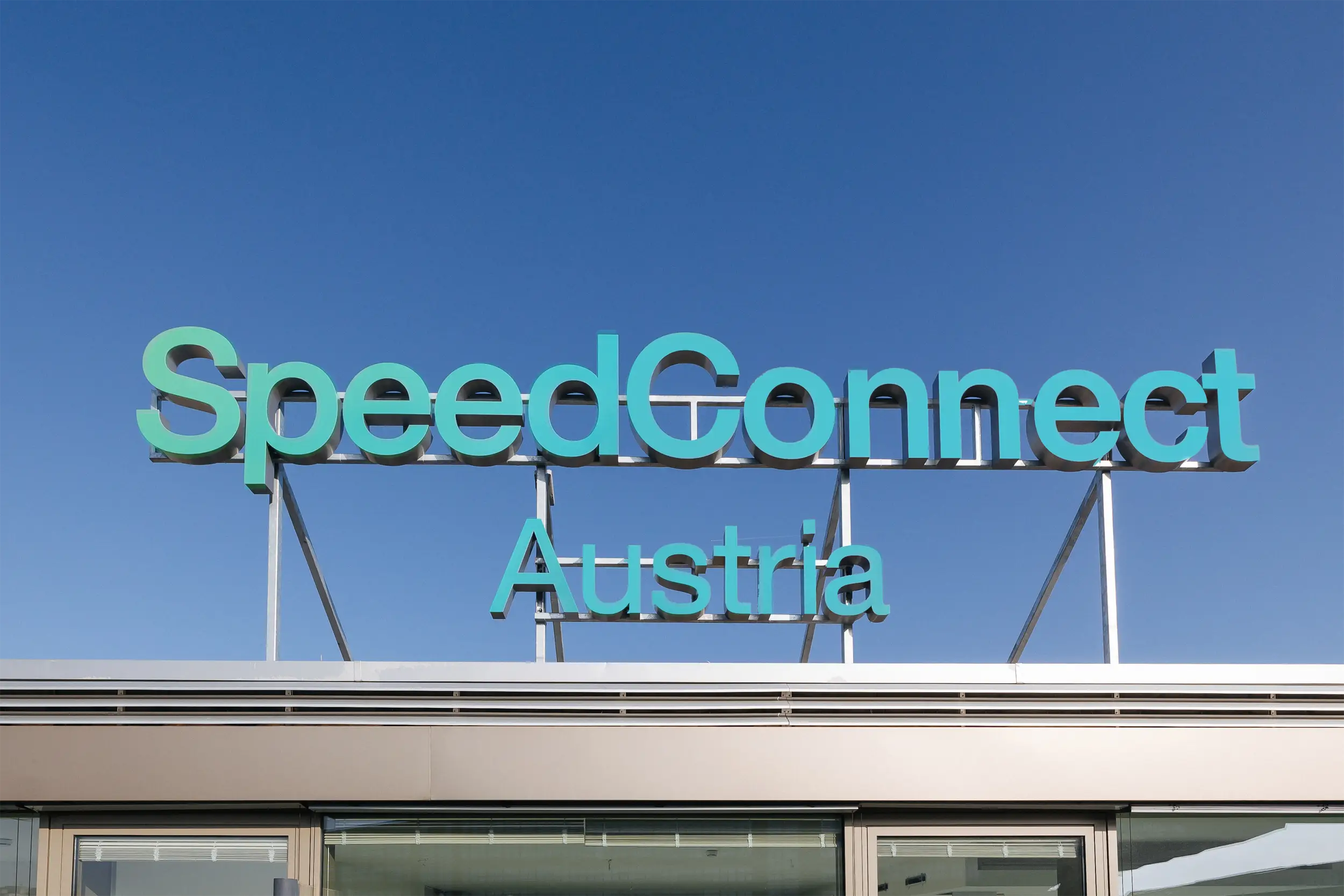
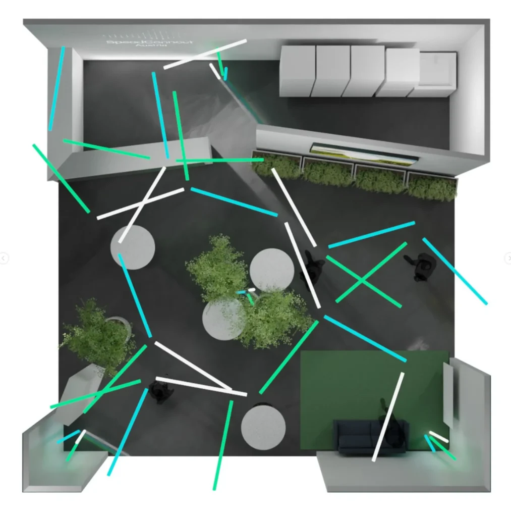
The creative process was about distilling this vision into a language of visuals and interactions that would resonate deeply with the audience. The logo became a symbol of connection, blending Austria’s landscape with the flow of data, grounding technology in a sense of place. It had to feel powerful yet accessible, like a promise kept. We designed with precision, using flowing fibers and clean lines that evoked both simplicity and speed. Greens and blues brought the brand to life, chosen to reflect trust, growth, and innovation—qualities we wanted people to feel instantly when they encountered Speed Connect Austria.
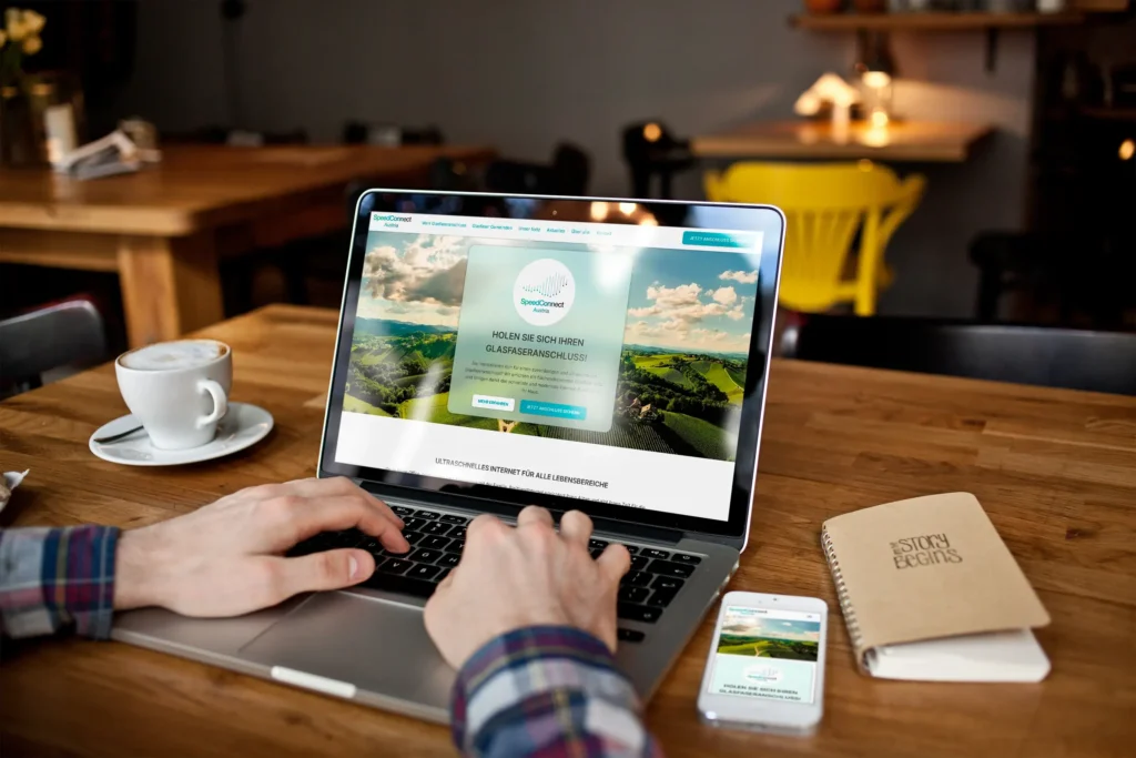
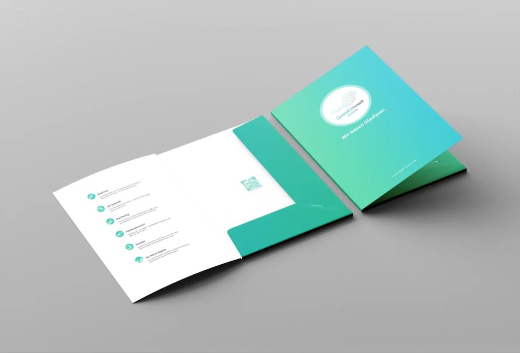
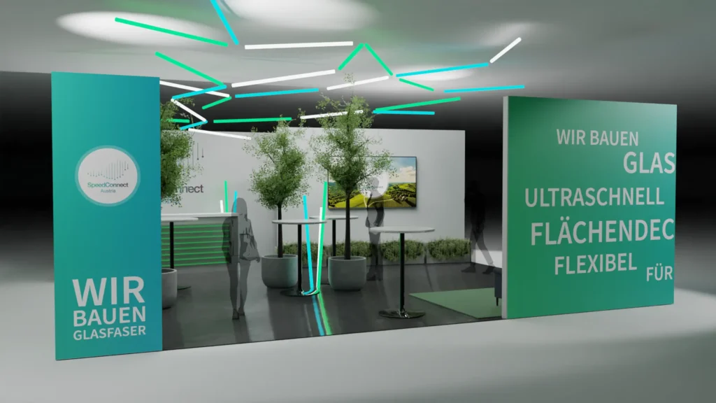
Beyond just the look, we wanted to create a seamless journey for customers. The website became the centerpiece, a user-friendly platform where customers could explore options, feel informed, and see how connectivity could change their lives. Each part of the brand—whether a community brochure or social media post—was crafted to feel unified, carrying a consistent message of empowerment and reliability.
“Working with DOIT. has been a journey of discovery and creation. They didn’t just give us a logo; they helped us shape our identity from the inside out. I remember our first meetings—they challenged us to think differently, to go beyond just explaining our services and really connect with our audience. They brought a deep sense of purpose to the process, and one of my favorite moments was seeing our brand for the first time. It felt like they’d captured something essential, something that spoke to who we are and what we stand for. DOIT. brought creativity, honesty, and insight to every step. This wasn’t just business—it was a collaboration that elevated us.”
The impact was immediate and encouraging. The brand’s identity resonated across rural Austria, sparking a new level of interest and trust. People saw themselves in this vision, and communities felt they were finally part of a connected future. And as Speed Connect Austria grows, so does our partnership. We continue to adapt, refine, and support their journey, ensuring that this brand remains a symbol of connection and progress for years to come.